This section is all about candlestick charts, a popular tool used by traders to predict price movements in financial markets. We’ll break down the basics of candlestick patterns and how to read them in a straightforward way.
Candlestick charts are a method of displaying price movements over time.
The Japanese candlestick charting technique has a long history, dating back to the 1700s. During that time, other charting methods like bar charts hadn’t been developed yet. Japanese traders used this technique to trade in their rice market.
The technique gained global popularity when American traders learned about it from Japan. It became widely known after Steve Nison, an American analyst, introduced candlestick charting to the United States and beyond. These charts are valuable because they provide clear insights into market psychology and price changes.
In our previous article, we discussed why candlestick charts are so popular today. Now, we’ll explain the basic components that make up candlestick patterns and individual candles.
How to Read Candlestick Charts
A candlestick is formed by combining four key pieces of information: the opening price, high price, low price, and closing price.
The way these four prices relate to each other during the day determines how the candlestick looks. If you switch to a different time frame, such as a shorter or longer period, the opening, high, low, and closing prices for that specific time frame will create a new candlestick pattern.
For example, if you choose a 1-hour trading time frame, your charting software will combine the opening, high, low, and closing prices for each hour. These four prices will then be used to create a new candlestick on your chart for every hour.
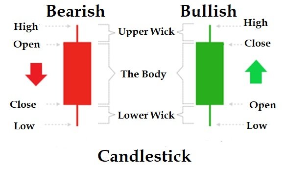
The Open price
The open price, as mentioned in the image above, is the first piece of information used to create a candlestick. It represents the price at which a stock or security starts trading during a specific period.
For example, on a daily chart, the open price refers to the price of the stock or security at the beginning of that day’s trading. This means that the stock started trading at the open price for that day. The same concept applies to any time frame you choose when analyzing market data in your charting software.
- In a bullish candlestick, the open price is located at the bottom edge of the body of the candlestick.
- In a bearish candlestick, the open price is located at the top edge of the body of the candlestick.
The High Price
The high price is the highest price that a stock or security reaches during a given period, and it corresponds to the top of the candlestick.
If the security opens and trades consistently lower than the opening price throughout the entire period, there won’t be any wick at the top, and the open price will also be the high price for that period.
The Low price
The bottom of the candlestick corresponds to the low price, which is the lowest price that the stock or security reaches during a given period.
If, after opening, the stock trades above the open price throughout the period, it forms a bullish candle. In this case, the open price will also be the low price of the period, and there won’t be any wick at the bottom of the candlestick.
The Close price
The close price is the price at which a security finishes trading during a given period of time. It’s the final and most important piece of information used to complete a candlestick for that period. The closing price helps determine whether a candlestick is bullish or bearish and shows which side is dominating the market.
- If the closing price is higher than the open price, the candlestick is bullish and is typically colored green.
- If the closing price is lower than the open price, the candlestick is bearish and is typically colored red.
Understanding the close price in relation to the open price for a given period is crucial to identify market control. Bulls win when the price closes higher than the open, and bears win when the price closes lower than the open.
Based on the time frame you select (e.g., daily, 1-hour, 15-minute, 5-minute, 1-minute), these four key data points (open, high, low, and close) are combined to form each candlestick. Multiple candlesticks, each representing a different time period, are then used to create a full candlestick chart.
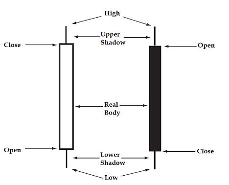
These four pieces of data — open, high, low, and close — are also known as OHLC, and both candlestick charts and bar charts are generated based on this information.
How a candlestick charts are formed – 4 simple steps
Here are the four simple steps used to draw a candlestick chart:
We will explain how to draw a daily candlestick chart, but the same concept applies to any time frame.
- Opening: The process starts when the market opens. The open price is marked on the chart.
- Real Body: As soon as the security starts trading, the most recent traded price and the open price are combined to form a rectangle, called the real body of the candlestick. The real body represents the range between the open and close prices.
- If the close price is higher than the open, the body is colored green (bullish).
- If the close price is lower than the open, the body is colored red (bearish).
- Upper Wick: If the price reaches a high during the session and then starts trading lower, a line is drawn from the top of the real body to the highest point of the price. This line is called the upper wick, and it represents the high of the day.
- Lower Wick: If the price reaches a low during the session and then starts trading higher, a line is drawn from the bottom of the real body to the lowest point of the price. This line is called the lower wick, and it represents the low of the day.
These steps may vary slightly depending on how the security is traded in the market, but the core concepts remain the same.
Sometimes, a candlestick may have no upper shadow or lower shadow. This happens when the price doesn’t reach the high or low during the trading session.
To draw a candlestick for a day, you need the open, high, low, and close prices for that day.
To understand the candlestick, you need to know what the body and shadow are. The length of the body and shadows is key information for chartists.
The body of a candle
The body of the candlestick is the box formed between the open and close prices of the session. It shows the difference between these two prices.
- When the closing price is lower than the opening price, the body turns red (bearish).
- When the closing price is higher than the opening price, the body turns green (bullish).
If you’re looking at a daily candlestick, the real body represents the range between the open and close prices for that day’s trading session. A red body means the close was lower than the open, while a green body means the close was higher than the open.
The length of the body indicates how much control the bulls or bears have over the market.
- If the market opens at a low and the body is long, closing at the high of the session, this suggests that bulls are strongly in control.
- In a bearish market, sellers dominate, driving the price lower from the open to the close.
A long bullish candle (green) shows a significant price movement for the day, indicating strong buying pressure. If the bullish candle opens at the bottom and closes at the high, it could signal a trend reversal, meaning the market is shifting direction.
Similarly, after a long uptrend, a long bearish candle (red) at the top could indicate a trend reversal, signaling that sellers are taking control and the trend might be about to change.
For your further studies you can refer to the following important candlestick reversal patterns;
- Three inside up/down candlestick pattern
- Three outside up/down candlestick pattern
- Bearish or bullish engulfing
- Piercing patterns
- Morning star
- Evening star
- Shooting star
- Inverted hammer
- Hanging man
- Hammer
The Shadows, Wicks, or Tails of a Candle
In a candlestick, you’ll notice lines above and/or below the real body. These lines represent the high and low prices of the session. Together, these lines are called shadows, and they are also referred to as wicks or tails by many chartists.
- If a security opens at a specific price and then drops throughout the session, there won’t be any wick above the body of the candle.
- If the security opens and only rises without dropping below the open price, there won’t be a wick below the body.
The wick or tail of the candlestick indicates market rejection of certain price levels. In other words:
- Upper shadows (above the body) show that the market rejected higher prices.
- Lower shadows (below the body) show that the market rejected lower prices.
Wick Length and Market Sentiment
- A long wick formed after a long downtrend suggests that the trend may be over, as demand is increasing and supply is decreasing.
- A long wick at the top of a bullish candle after a strong price increase signals that demand is fading and supply is rising.
The size of the wick compared to the real body is crucial for understanding the market sentiment. A long wick compared to a short body can suggest a reversal or uncertainty in the market.
Why Do Traders Prefer Candlestick Charts?
Candlestick charting is popular because it’s easy to read and visually appealing. It helps you quickly understand whether buyers or sellers controlled the market during a session and provides clear indicators of price trends. It also makes it easy to identify the open and close prices.
Many traders favor candlestick charts for several reasons:
- They clearly display important price data: opening, highest, lowest, and closing prices.
- They reflect market psychology, helping traders understand sentiment.
- They identify signals for reversals (changes in price direction) and continuation (price continuing in the same direction).
- They are visually straightforward and easy to interpret.
- They have recognized patterns that can predict future price movements.
They highlight weaknesses in trends and possible reversal signals more effectively than standard bar charts.
Interpreting Wick Size
- A small wick indicates lower volatility during that time period.
- A small wick with a large body means that one group (either bulls or bears) controlled the market.
- A small body with large wicks suggests indecision, and this pattern is often referred to as a Doji, showing a struggle for control between buyers and sellers.
Color of the candle
In candlestick charting software, if the close price is below the open price, the candlestick will be displayed in red, indicating a bearish market. If the close price is above the open price, the candlestick will be displayed in green, indicating a bullish market.
However, you can customize the colors of the candlesticks according to your personal preference. Some traders choose to use white for bullish candles and black for bearish candles instead of the typical green and red. Alternatively, red may also be used for bearish candles.
A green body on a candlestick represents bullish price action, while a red body represents bearish price action.
Most charting software allows you to color code candlesticks to your liking. Many traders prefer to use black and white colors for simplicity: white for a bullish candle and black or red for a bearish candle.
Here’s how the candles will appear when using black and white colors:
To understand the psychology of market participants, it’s important to pay attention to the size, location, and color of the candles in candlestick charting.
- Size: The length of the candlestick’s body and wicks shows the strength of the market move. A long body suggests strong buying or selling pressure, while a short body indicates indecision or a lack of direction.
- Location: The position of the candle relative to the previous ones can reveal shifts in market sentiment. For example, a bullish candle at the bottom of a downtrend may signal the start of a reversal.
- Color: The color of the candlestick (green for bullish or red for bearish) shows whether buyers or sellers were in control during that period.
A combination of several individual candlesticks can form a pattern that signals potential market reversals. These patterns, like doji, engulfing, or hammer patterns, give traders clues about changes in market sentiment and possible trend shifts.
Identifying Candlestick Patterns for Trading
To make informed trading decisions, traders look for specific candlestick patterns. These can indicate whether prices will continue moving in the same direction or change.
Key Steps for Spotting Patterns
- What Is the Pattern: Determine if the pattern involves one, two, or three candlesticks. Understand whether it indicates a potential rise (bullish) or fall (bearish).
- Where Is the Pattern: Identify the pattern’s position in relation to the current trend. For instance, a bullish pattern should appear after a downtrend, while a bearish pattern should follow an uptrend.
- How Big Is the Pattern: Consider the size and time-frame of the pattern. Patterns on longer time-frames (like weekly) are generally more significant than those on shorter time-frames (like 15 minutes).
- Volume with the Pattern: Analyze trading volume. High volume accompanying a pattern adds reliability to the setup, while low volume may weaken it.
It’s important to practice identifying and trading candlestick patterns on a demo account before using real money. A demo account allows you to familiarize yourself with the patterns, test strategies, and gain confidence without the risk of losing actual funds. By practicing, you can better understand how different patterns work in various market conditions and avoid making costly mistakes when you start trading with real money.
Disclaimer: In addition to the disclaimer below, please note, this article is not intended to provide investing or trading advice. Trading in the stock market and in other securities entails varying degrees of risk, and can result in loss of capital. Most investors and traders lose money. Readers seeking to engage in trading and/or investing should seek out extensive education on the topic and help of professionals.